Light gray text on a white background looks clean and modern in a design mockup viewed on a calibrated monitor in a dim office. On a phone screen in direct sunlight, it disappears. For someone with deuteranomaly (the most common form of color vision deficiency, affecting about 6% of males), certain color combinations that look distinct to a designer are nearly identical.
This isn't an edge case. Roughly 8% of males and 0.5% of females have some form of color vision deficiency. That's about 1 in 12 male visitors to your site. Add in aging eyes (contrast sensitivity starts declining around age 40), low-quality displays, and outdoor viewing conditions, and the population affected by poor text contrast grows well past the clinical statistics.
What the numbers mean
WCAG 2.1 defines two contrast thresholds. The AA standard requires a contrast ratio of at least 4.5:1 for normal text and 3:1 for large text (18pt or 14pt bold). The AAA standard raises those to 7:1 and 4.5:1 respectively.
The contrast ratio is calculated from the relative luminance of the foreground and background colors. Pure black (#000000) on pure white (#FFFFFF) gives a ratio of 21:1, the maximum possible. Medium gray (#767676) on white gives exactly 4.54:1, just barely passing AA for normal text. Light gray (#999999) on white gives 2.85:1, failing AA.
The difference between 4.5:1 and 2.85:1 doesn't sound dramatic, but it's the difference between readable and unreadable for a significant portion of your audience. And it's not just body text that matters. Navigation links, form labels, placeholder text, button labels, error messages, and footer content all need to meet the threshold.
Placeholder text is the single worst offender across the web. The default browser placeholder color in most browsers is around #757575 to #A9A9A9 depending on the platform, and many designers override it to something even lighter. Since placeholder text often serves as the only label for a form field (a separate accessibility problem), making it unreadable compounds the damage.
Why designers push back and why they're wrong
The most common objection is aesthetic. "4.5:1 contrast looks too harsh." This is a calibration problem, not a design problem. Designers working on high-end monitors in controlled lighting see more contrast than their users do. A ratio that feels heavy-handed on a 500-nit P3 display looks perfectly normal on a 250-nit sRGB laptop screen in a well-lit room.
The second objection is that AA compliance limits the color palette. It doesn't. For any given background color, there are thousands of foreground colors that pass AA. The constraint removes a narrow band of near-background colors that are functionally unreadable anyway. If your brand identity depends on text that's nearly invisible, the brand identity has a problem.
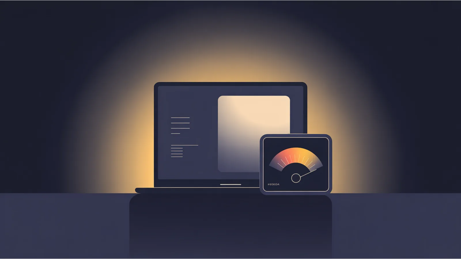
What the Text Contrast Audit checks
The Text Contrast Audit evaluates every text element on your page against both AA and AAA thresholds. For each element, it extracts the computed foreground color and background color (accounting for opacity, gradients, and inherited backgrounds), calculates the contrast ratio, and reports whether it passes or fails.
The audit separates results by text size. Large text (18px regular or 14px bold and above) needs 3:1 for AA, so it gets evaluated against the lower threshold. Normal text needs 4.5:1. This distinction matters because many sites pass for headings but fail for body text.
Elements with background images or complex gradients get flagged for manual review, since automated contrast calculation against non-solid backgrounds isn't reliable. The audit notes these rather than guessing.
For each failure, the tool suggests the closest color that would pass the threshold, calculated by adjusting lightness while preserving hue and saturation. This gives you a fix that stays within your brand's color family rather than jumping to an arbitrary compliant color.
The results pair well with the Prefers Color Scheme Audit to verify contrast in both light and dark modes, and the WCAG Accessibility Audit for a full compliance check across all criteria.
Quick fixes that don't require a redesign
Bump your body text from #777 to #595959. That single change takes you from 4.48:1 (fail) to 7.04:1 (AAA pass) on a white background, and the visual difference is subtle.
For links, use your brand's primary color but check it. Many brand blues (#0066CC, #1A73E8) pass AA on white. Some don't (#3399FF is only 3.0:1 on white, failing AA).
For placeholder text, either darken it to at least #767676 or, better, use a visible <label> element and keep the placeholder as supplementary hint text that doesn't need to carry the full meaning.
For dark-mode themes, the common mistake is pure white (#FFFFFF) text on pure black (#000000). This actually passes with maximum contrast (21:1), but it causes eye strain from excessive contrast, especially on OLED screens. Off-white (#E0E0E0) on near-black (#1A1A1A) gives 14.5:1, well above AAA, and is significantly more comfortable to read.
If you're setting up a site for the first time, The $97 Launch includes a color-system approach that nails AA contrast from the start, so you're not patching colors after launch.
Fact-check notes and sources
- Color vision deficiency prevalence: approximately 8% of males and 0.5% of females of Northern European descent. Source: National Eye Institute.
- WCAG 2.1 SC 1.4.3 Contrast (Minimum): W3C WCAG 2.1, Level AA, 4.5:1 for normal text, 3:1 for large text.
- WCAG 2.1 SC 1.4.6 Contrast (Enhanced): W3C WCAG 2.1, Level AAA, 7:1 for normal text, 4.5:1 for large text.
- Contrast ratio calculation formula: W3C Relative Luminance Definition.
- Default browser placeholder colors vary by engine: Chromium ~#757575, Firefox ~#A9A9A9, Safari ~#A9A9A9.
Related reading
- Tab order and focus sequence — the keyboard accessibility companion to visual contrast
- Table accessibility markup — contrast inside data tables
- Image alt text auditing — another fundamental accessibility check
- Form accessibility patterns — placeholder contrast and label visibility
- Prefers color scheme detection — verifying contrast across light and dark modes
This post is informational, not accessibility-consulting or legal advice. Mentions of WCAG and W3C are nominative fair use. No affiliation is implied.
