
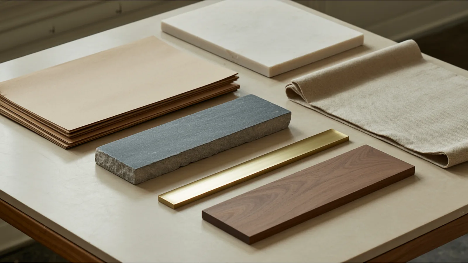
The styling layer of the web is a solved problem, and the receipts are public. I pulled the current star counts off the GitHub API this morning: Bootstrap sits at 174,625 stars, shadcn/ui at 121,791, Tailwind at 97,292, animate.css at 82,744, Bradley Traversy's design-resources-for-developers at 66,724, normalize.css at 53,520, Awesome Design Tools at 40,953, css-protips at 30,253, AOS at 28,059, Pico at 16,805, GitHub's own Primer CSS at 13,010, and Open Props at 5,497. Sindre Sorhus's master awesome list, the index of all the other indexes, has 498,612.
That is an enormous amount of free, battle-tested design code. You can have a normalized box model, an accessible component set, a token system, a spacing scale, a full animation library, and a curated list of every font and stock photo source on earth without writing a line or spending a dollar.
And yet. Install all of it, build a site, and put it next to the sites that agencies charge five figures for, and yours will still look like a template. Not broken. Not ugly. Just visibly cheaper, in a way that is hard to point at.
I got tired of hand-waving about this, so I measured it. I saved copies of 17 high-end real estate websites, including the full design system stylesheet that most of them run on, and read through the actual declarations. (If you want to do the same: read each site's Terms of Service and robots.txt first and honor both, and prefer just saving the page from your browser. Two or three pages is a "Save Page As", not a crawler. The beginner guide covers the boundaries properly.) Real estate is a good test case because the money is unambiguous. These are people whose entire business is convincing someone to hand them the largest transaction of their life, and they buy the most expensive websites on the consumer internet.
Here is what the markup actually says.
First, an honest caveat about the sample
Sixteen of the seventeen came from a portfolio page titled "award-winning real estate website designs." That page is published by a company that sells real estate websites, about its own client work. It is a vendor showing off its own portfolio, not an independent ranking, and I want that stated plainly before I quote a single number off it.
It also produced the first finding, which I did not expect and which reframes everything after it.
I checked what each of the sixteen was actually built on. Fifteen run on that same vendor’s platform. The sixteenth runs on a mainstream drag-and-drop site builder. Not one of the "best real estate agent websites" is a bespoke engineering effort. I added a seventeenth, a team site I was looking at separately, and it turned out to be on the same vendor platform too.
Sit with that. Seventeen sites that read as expensive, and the code underneath them is one commercial template plus one site-builder instance. Whatever is making them feel costly, it is not the code. The code is shared. Any two of those sites could swap stylesheets and still look like themselves.
That is the thesis of this article, arrived at by accident in the first ten minutes.
The type scale is light, huge, and very tight
This is the biggest tell, and it is the one self-built sites get backwards most reliably.
The design system defines its headings as a fluid scale. These are the real declarations:
- h1:
clamp(4rem, 4.453125vw, 14.25rem), weight 400, line-height 1.03 - h2:
clamp(3.25rem, 3.125vw, 10rem), weight 400, line-height 1.15 - h3:
clamp(2.625rem, 2.343vw, 7.5rem), weight 400, line-height 1.14 - h4:
clamp(2rem, 1.093vw, 3.5rem), weight 300, line-height 1.12 - h5:
clamp(1.5rem, 0.78125vw, 2.5rem), weight 300, line-height 1.17 - h6:
clamp(1.25rem, 0.664vw, 2.125rem), weight 300, line-height 1.3 - body:
clamp(1rem, 0.625vw, 2rem), weight 300, line-height 1.38
Two things there matter more than the sizes.
The headings are weight 400 and 300. Regular and light. Nothing is bold. The default instinct on a self-built site is to reach for 700 on every heading, because bold reads as important, and most frameworks nudge you that way. The expensive move is the opposite: go bigger and go lighter. A 4rem heading at weight 300 has presence without shouting. A 2rem heading at weight 700 just shouts.
The second thing is the line-heights. Headings run 1.03 to 1.17. Body runs 1.38. That gap is deliberate and it is large. Tight leading on display type makes a multi-line headline read as one shape instead of three stacked sentences. Most default stylesheets set something like 1.2 on headings and 1.6 on body, a smaller gap in both directions, and the result is headlines that feel loose and body copy that feels crowded.
You can copy those seven declarations into any project in about ninety seconds. No repo will tell you to.
The palette is not black and white, and the accent is muted
I counted every hex color across all seventeen saved pages. The frequency leaders are what you would guess: #ffffff appears 298 times, #000000 250 times. The interesting ones are underneath.
#848484 shows up 180 times. #1a1a1a 93 times. #403e3f 54 times. #f1f0eb 54 times. #5f5d61 37, #e2e0d9 36, #fbfbf9 35, #141414 32, #3e1214 30, #e4dfd8 29, #c28563 28, #fbf9f7 27, #c09b57 21.
Read that list as colors rather than codes. The grounds are not white, they are bone: #f1f0eb, #fbfbf9, #e2e0d9, #e4dfd8, #fbf9f7. Slightly warm, slightly yellow, a few points off pure. The inks are not black, they are charcoal: #1a1a1a, #141414, #403e3f. And the accents are muted and earthy: #c09b57 is an old gold, #c28563 a clay, #3e1214 an oxblood.
The design system's own default token set confirms it rather than leaving it to inference:
--sys-color-primary-1: #fff--sys-color-primary-2: #1a1a1a--sys-color-primary-3: #161515--sys-color-primary-4: #eeede9--sys-color-primary-5: #000--sys-color-primary-accent: #b18463--sys-color-primary-accent-dark: #916648--sys-color-primary-accent-light: #db9d72
One accent. Three shades of it. That is the entire chromatic budget. Everything else is a warm neutral or a gray step.
Compare that to what a framework hands you. Bootstrap ships a primary blue, a success green, a danger red, a warning yellow, an info cyan, and more. Those are functional state colors designed for dashboards, and they are fully saturated for good reason. Build a marketing site on the defaults and you have already spent five times the chromatic budget these sites operate on.
Here is the part I like, because it shows the system flexing rather than dictating. One of the seventeen overrides the accent to #FFC800, a bright yellow, with #010e41 navy as a secondary. That is a much louder pair than the system default. It works because the rest of the discipline holds around it. One loud accent inside an otherwise restrained system reads as confident. A loud accent plus five other colors reads as a template.
The whitespace has its own token scale, and the numbers are enormous
This is the finding I would most want a small-business owner to see, because whitespace costs nothing and it is where self-built sites lose most obviously.
The system tokenizes spacing the same way it tokenizes color:
--sys-grid-gap-xsmall: .5rem--sys-grid-gap-small: 1rem--sys-grid-gap-medium: 1.5rem--sys-grid-gap-large: 3.875rem--sys-grid-gap-xlarge: 15rem--sys-spacing-large: clamp(8.5rem, 9.4531vw, 30.25rem)--sys-spacing-xlarge: clamp(11.5rem, 6.8554vw, 21.9375rem)
That extra-large grid gap is 15rem. At a 16px root that is 240 pixels of nothing. The large spacing token resolves between 136 and 484 pixels. There are section paddings in there set to a flat 176 pixels and others set to 7.8vw.
Nobody arrives at 240 pixels of empty space by feel. It feels wrong while you are building it. It looks like a mistake in the editor. You only get there by deciding in advance that vertical rhythm is a named token with a value, and then trusting the token.
The container widths are similarly explicit: small at 67.875rem (1086px), medium at 82rem (1312px), large at 90rem (1440px). Three widths, chosen once, applied everywhere.
The motion is three curves and one duration
I pulled every cubic-bezier and every transition duration across the corpus.
The easing curves cluster hard. cubic-bezier(0.645, 0.045, 0.355, 1) appears 24 times, the standard ease-in-out cubic. cubic-bezier(0.23, 1, 0.32, 1) appears 18 times, an ease-out quint that decelerates hard at the end. cubic-bezier(0.835, 0, 0.19, 1) appears 16 times, a much more aggressive in-out. After that the counts fall into single digits.
Durations are tighter still. Inside the design system stylesheet, transition: all .3s appears 68 times, transition: all .3s ease 23 times, transition: opacity .3s 17 times, transition: opacity .3s ease 15 times, transition: all .2s 14 times. Across the rendered pages, 0.3s appears 163 times and 0.2s 146 times.
So: three curves, and effectively two durations for interface motion. The longer values I found, in the 2s through 6s range, are not interface transitions at all. They belong to slow image pans and marquee loops, which is a different job.
There are about 38 named keyframe animations available in the system. The pages use a small handful, almost all variations on fade and slide.
That is the discipline. A large library exists, and the sites decline most of it. animate.css has 82,744 stars and offers dozens of effects including bounce, flip, rubberBand, jello, and heartBeat. Nothing in this corpus bounces. The restraint is the design decision, and installing the library works against it by making forty effects equally available at zero cost.
Sixteen of seventeen lead with video
Every site in the set except the site-builder one carries video in the hero region. Not a slideshow, not a static image with a parallax nudge. Actual moving footage.
This is the one finding with a real price attached, and it is worth being blunt. You cannot download this. A drone pass over a property, a slow interior dolly, a well-lit agent piece to camera: that is a shoot, a crew, and an edit.
That is what the money in an expensive website is actually buying. Not the code, which is shared. Not the tokens, which I just gave you. The photography and video budget, and the art direction to use it well.
And they are heavy
Since I had the pages saved, I measured them.
The HTML documents run from 425 KB (the site-builder one) to 1,059 KB. The median sits in the low 600s, with individual sites landing at 608 KB, 662 KB and 951 KB. The shared design system stylesheet is 1.49 MB on its own, and a large part of that is roughly seventy icons inlined as data URI SVGs, everything from --sys-icon-bed and --sys-icon-sqft to --sys-icon-zillow.
For contrast, a hand-built Eleventy realtor site I maintain serves its homepage in 184 KB of HTML. That is between a third and a fifth of what these pages ship, and the gap widens once the template's JavaScript loads.
I am not scoring points. It is a real trade. Those sites bought design consistency, a listings integration, and a content management system a working agent can actually use, and they paid for it in weight. That is a defensible purchase.
But it does mean the performance lane is open. If you build your own, you can take the type scale, the palette, the spacing tokens, and the motion discipline, which are the parts that make those sites feel expensive, and ship them in a fraction of the payload. The craft and the bloat are separable. They only arrive bundled because they came from the same vendor.
So what do the repos actually give you, and what do they not
Here is the honest split, having spent a day inside both.
What the repos genuinely solve:
- The reset and the box model: normalize.css at 53,520 stars ended that argument years ago.
- Accessible component behavior: focus management, keyboard navigation, and ARIA wiring in shadcn/ui and Primer represent thousands of hours you should not repeat.
- The token mechanism: Open Props and Style Dictionary give you the plumbing for a token system.
- Font delivery: modern-font-stacks at 3,505 stars is a genuinely useful reference for system stacks.
- Curation: design-resources-for-developers at 66,724 stars will find you the stock photo site.
What no repo ships, and what actually separated these seventeen sites from a default build:
- The values inside the tokens. Open Props gives you a spacing scale. It does not tell you the section gap should be 240 pixels. That is a taste decision, and it is the decision that matters.
- Subtraction. Every repo adds. animate.css adds forty effects. Bootstrap adds six semantic colors. The craft here was three easing curves and one accent. No package manager has an uninstall step for ambition.
- Weight discipline in type. Going lighter as you go larger is counterintuitive and no framework default suggests it.
- Off-white instead of white. Two hex digits of difference, and no library will make you notice it.
- A photography budget and the art direction to spend it. This is the real moat. It is not a technical problem and it has never had a technical answer.
There is one genuinely interesting hybrid worth naming, because it attacks exactly the gap I am describing. The UI UX Pro Max skill, at 119,298 stars, is an AI skill rather than a stylesheet: it generates a page pattern, palette, and font pairing for your specific business instead of handing you components. I wrote about running it against a live site here. It is the closest thing I have used to a repo that ships taste, and it still hands you a starting point rather than a finished art direction.
The seven numbers, if you want to just take them
If you skim one section, this one. These transfer to any site, in any framework, in an afternoon:
- Headings at weight 300 to 400, never 700. Get emphasis from size, not thickness.
- Heading line-height between 1.03 and 1.17. Body at 1.38. Make the gap wide.
- Ground color off-white, not white.
#f1f0ebor#eeede9rather than#ffffff. - Ink charcoal, not black.
#1a1a1arather than#000000. - Exactly one accent color, in three shades. Muted beats saturated.
- A named large spacing token in the 8rem to 15rem range, and the discipline to use it between sections.
- Three easing curves and a 0.3s duration. Start with
cubic-bezier(0.645, 0.045, 0.355, 1)and stop adding.
Add a prefers-reduced-motion block that switches every one of those transitions off, because the corpus is not uniformly good about that and you should be better than your reference material.
None of that requires a dependency. All of it is in the seventeen sites I measured, and none of it is what those sites cost money for.
If you are looking at a five-figure quote and wondering what you would actually be buying, the answer from this teardown is: a content management system, a listings integration, and someone else's taste. The first two are real products. The third one is seven declarations, and I just published them. If you want the build-it-yourself version of that argument, from a blank domain to a working accessible site for about a hundred dollars, that is what The $97 Launch covers end to end.
Take the whole thing as a file your AI can use
Everything above is condensed into a single LLM-ready specification you can hand straight to Claude, ChatGPT, Gemini, or any coding agent:
Paste the file into your assistant, then add one line describing your site ("apply this to my Eleventy site at ./src, it is a dental practice, currently blue and white with bold headings"). It carries the measured type scale, the palette, the spacing and motion tokens, the paste-ready :root block, and a set of explicit instructions telling the assistant to work presentation-only, to keep the change additive and reversible, and to verify contrast by computation rather than by eye.
There is a companion file for the harder case, applying this to a site that already exists and already ranks: design-retrofit-audit-kit.md, which is the subject of the follow-up post.
Both are free, need no signup, and you are welcome to adapt them.
Two further files cover measuring somebody else's site in the first place: parse-a-site-starter-kit.md (beginner, with the full measured reference dataset) and parse-a-site-advanced-pipeline.md (the fetch cascade, extraction spec and verification harnesses).
Fact-check notes and sources
All GitHub star counts were read from the GitHub REST API on 21 August 2026 and will drift upward. Verify any figure at the repository itself.
- GitHub star counts: read via
api.github.com/repos/{owner}/{repo}on 21 August 2026. Bootstrap 174,625 (twbs/bootstrap); shadcn/ui 121,791 (shadcn-ui/ui); UI UX Pro Max 119,298 (nextlevelbuilder/ui-ux-pro-max-skill); Tailwind 97,292 (tailwindlabs/tailwindcss); animate.css 82,744 (animate-css/animate.css); design-resources-for-developers 66,724 (bradtraversy); nerd-fonts 64,333; normalize.css 53,520 (necolas/normalize.css); Awesome Design Tools 40,953; css-protips 30,253; AOS 28,059; SpinKit 19,332; Pico 16,805 (picocss/pico); Primer CSS 13,010; Open Props 5,497 (argyleink/open-props); Style Dictionary 4,777; modern-font-stacks 3,505; theme-specification 553; awesome 498,612 (sindresorhus/awesome). - The site sample: the sixteen exemplar sites are the ones listed on a "best real estate agent websites" portfolio page published by a real-estate website vendor about its own client work. It is a vendor portfolio, not an independent ranking, which is why the platform finding is unsurprising in hindsight. A seventeenth site, on the same platform, was added separately. The individual agents and brokerages are deliberately not named: they are private businesses that did not ask to be a case study, and nothing in the analysis depends on which one is which.
- Platform identification: made by inspecting each saved page for vendor markers. Fifteen of sixteen carry the same vendor's markers; the sixteenth carries a mainstream site builder's markers. Five also carry a national brokerage's brand font references, which reflects the agents' brokerage rather than the site platform.
- Design token values: read from the vendor’s public theme stylesheet, 1.49 MB, on 21 August 2026. Values are quoted verbatim. The custom-property names are quoted with their vendor prefix replaced by a neutral
--sys-so the shape of the system stays readable without identifying the vendor; nothing else about them is changed. Vendors change these without notice. - Color frequency counts: counted across all seventeen saved HTML documents. These count occurrences in markup, which weights heavily-repeated inline declarations, so treat them as evidence of which colors are in the system rather than as a measure of visual area.
- Easing and duration counts:
cubic-beziercounts are across all seventeen documents; thetransition:counts cited are from within the Visionary stylesheet specifically. - Page weights: measured as the byte size of the saved HTML document only. This excludes CSS, JavaScript, fonts, images, and video, so the real-world gap between these sites and a lightweight build is considerably larger than the HTML figures alone suggest. The 184 KB comparison figure is the homepage of an Eleventy realtor site I build and maintain.
- The video finding: based on the presence of video elements or MP4 references in the saved markup, which indicates video is present in the page rather than proving it autoplays in the hero on every viewport.
Related reading
- The beginner guide to parsing a premium site yourself: what these platforms actually charge, and the five-step path to reproducing the design layer for free.
- The advanced pipeline: the fetch cascade, deterministic extraction, and the cross-corpus data from 51 measured pages.
- Run a Design System Generator on Your Own Site: the UI UX Pro Max skill, and what happens when you point a design-system generator at a real business.
- Claude Design, and the one feature that makes it different from Figma: building a design system from an existing codebase rather than from a blank canvas.
- Self-hosting your fonts instead of loading them from a CDN: relevant here, because most of these sites still pull Montserrat from Google.
- Font loading strategy audit: a tool for checking whether your display face is actually arriving before first paint.
- Non-composited animation audit: once you have picked your three easing curves, this checks that they run on the compositor instead of the main thread.
This post is informational, not design or legal advice, and I am not a lawyer. The real-estate sites analyzed are deliberately not named: the point is the pattern they share, not any one business, and none of them asked to be a case study. The open-source projects are named because they are public works being credited. If you measure sites yourself, read each site's Terms of Service and robots.txt first and do not automate access where either prohibits it; prefer saving pages by hand. Measure presentation values such as type scale, spacing and color relationships, and never copy a logo, brand name, photography, written copy, or a distinctive overall look. Design token values and star counts are accurate as read on 21 August 2026 and will change.
